Action games, mobile controls, and "responsiveness"
I recently released BOSSGAME: The Final Boss is My Heart! I would love to write about what it feels like to release a game you've been working on for four years, the response, all that, but I haven't had time or clarity yet... it's still kind of a blissful fog. So instead, let's talk about controls.
I wanted to write a little bit about how I settled on the control scheme for Bossgame. Quite a few folks have mentioned how responsive Bossgame feels, and how they never dropped inputs while playing. Yay! Thank god, because it took me ages to get that right.
I'm genuinely pretty proud of the controls I settled on - one of my central goals (more of a self-challenge) was to make a mobile action game that created the same sort of back-and-forth tension of something like Dark Souls, without the frustration that trying to press buttons quickly on a phone usually entails. So let's chat about it!

Remove accidental commitment
One absolute necessity for Bossgame was to prevent accidental button presses that would lead to massive punishment. In typical action games, you tap a button on the controller, it resists a little before giving a satisfying click, and your character attacks or jumps. These actions often have commitment - they have risk & reward. If you attack at the right time, you defeat an enemy; at the wrong time, you get slapped.
However, on a phone, it is REALLY easy to slide your fingers over any of the buttons without resistance. If a mobile game's actions have the same commitment, you might find yourself jumping at the wrong time and falling down pits, or stuck attacking when you want to defend.
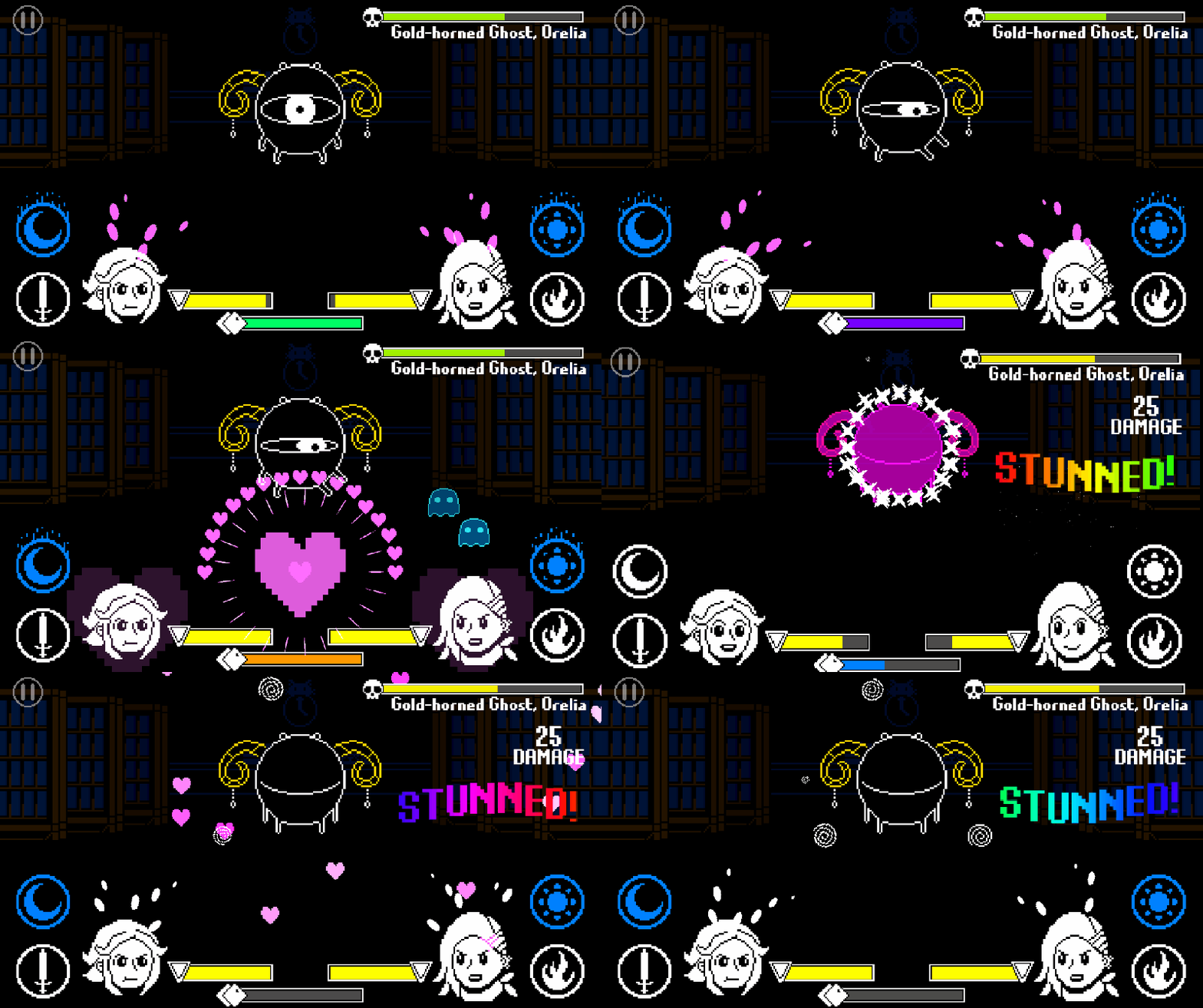
In Bossgame, attacks are high-commitment actions - they cost energy that you need to defend. If you accidentally fire one off at the wrong time, you may find your character getting stunned or KO'd. To prevent this, every attack requires a short hold & release to unleash. Weak, low-risk attacks take 0.5 seconds to charge, while heavy, high-risk attacks take 1.1 seconds to charge. After this time, the attack is fully charged, and the phone vibrates a bit and plays a visual and audio effect to alert the player. Finally, the attack won't fire until the finger is released.
This has a few interesting effects!
- By making the player press & hold the button for a moment to actually execute an action, you can greatly reduce the chance players accidentally overcommit!
- After playing for a while, players will mentally learn how long they have to hold each attack button, making it a reflex.
- The "release" after holding of serves as kind of a replacement for the satisfying click of a gamepad button; the player knows they've acted. It feels good!
On the flip side, there is one other main verb in Bossgame that works entirely differently: defending. Defending is an indiscrete action with no windup. Your characters can put up a shield for 0.05 seconds or 3 seconds. Every moment of defense costs your character a miniscule amount of energy, so it's relatively low-commitment; if you defend on accident, it costs you very little. Because defending is not risky, it can be a simple on/off button hold. I made sure that accidentally defending was something that was never punished - the only risk is if you hold your shield for a long period of time.

Where can we use this?
Of course, I did have to design the entire game around these ideas. The "holds" had to be at least long enough to prevent accidental presses; I couldn't add attacks with no windup. And putting up your defense on accident can never be punished by the game.
And if you consider a common game action like jumping, for example, you can see how this system has issues - jumping is usually designed to be a quick, no-windup action, but has a high risk factor (falling into pits, etc.) so it doesn't fit easily. Character movement in general is tricky: walking/running in games is usually very precise, but punishment for bad movement goes from 0 to 100 very quickly (it's either safe ground or spikes) which makes it a bad fit for this "hold & release" control scheme.
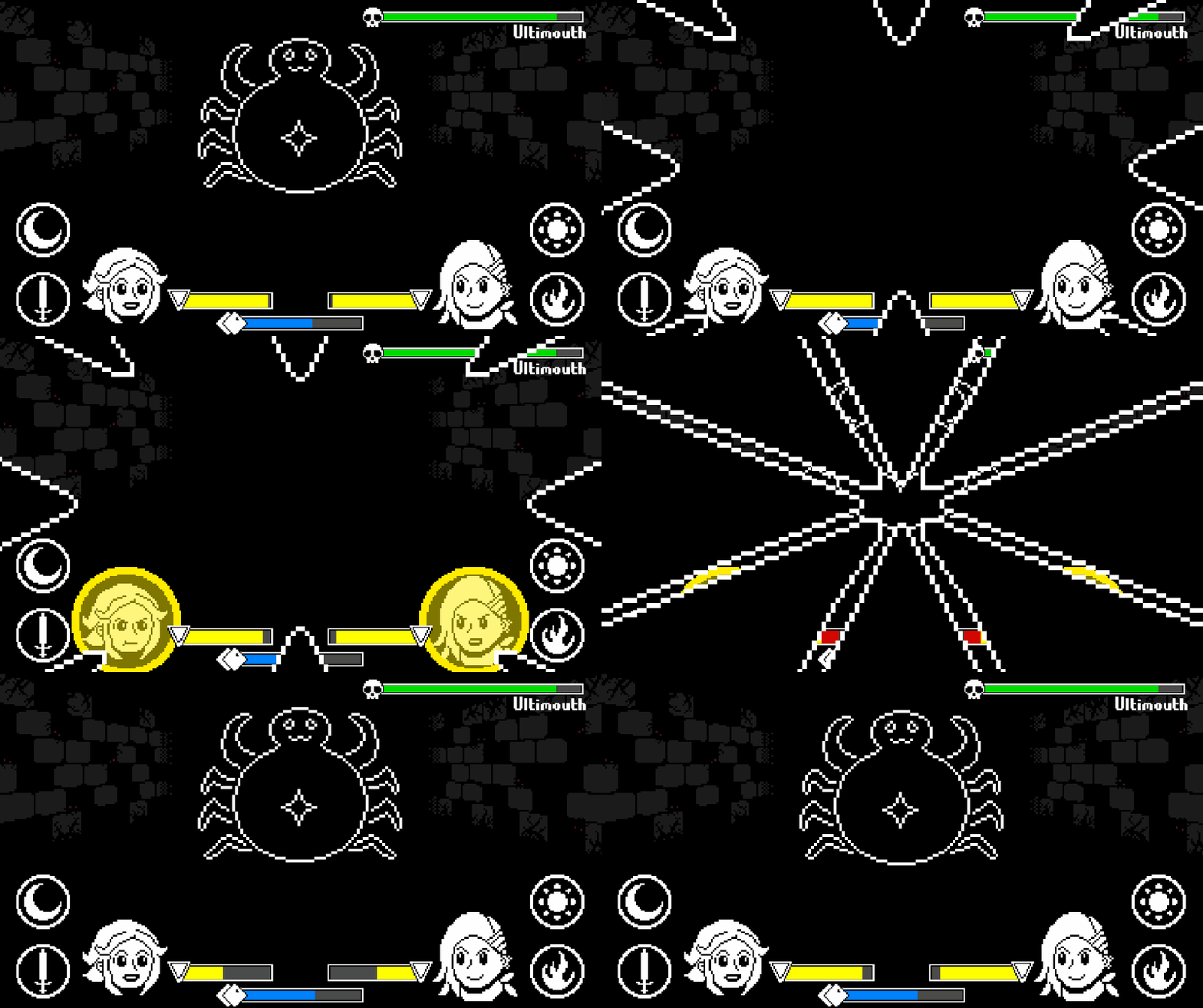
The above is why Bossgame is a game with zero player movement! A game with Dark Souls-esque combat but with zero movement seems simplistic; however, with the addition of a second hero to control & very mobile bosses, you can add a unique flavor of depth! In many ways, Bossgame's battles are closer to something like Punch-Out or Mario & Luigi.
There are definitely more ways to use these principles to make action games on mobile that feel responsive & fair, and I'm really curious to tweak & explore this idea more in future games.
Extra notes:
- Fewer, bigger buttons: Having only three buttons on each side of the screen makes it difficult to accidentally press the wrong thing. Try and make the most out of every action that requires its own button, instead of adding more buttons.
- Haptic feedback: Play a small vibration when players start any action; play a medium vibration when it's complete. Don't use vibration for anything else. It's not as good as the *click* of a controller button, but take what you can get. A lot of playtesters said this helped them feel confident their hands were doing what they wanted.
- Coyote time: As always, don't require perfect timing for inputs, this is especially true for finicky phone presses. If an attack is nearly charged (within 5-10 frames) and the player releases, I count it as an attack. If the player drops their defense early or puts it up late (within 5-10 frames) I also count it as a successful block.
Thanks for reading! Control schemes are a hard thing to show off or even talk about, but I hope that this helps inspire folks who might be interested in designing fast-paced mobile games.
If you're interested in Bossgame, you can check it out here: bossgamegame.com
Lily 💜